


When thick smoke from wildfires throughout Washington, Oregon, and California recently enveloped Ellensburg, causing residents to begin checking air quality counts daily, avoid going outdoors, and look frequently at the skies, CWU Graphics Professor David Bieloh had an idea.
As an award-winning graphic designer, he was very familiar with the annual Pantone Color of the Year series, for which the Pantone Color Institute studies color trends in order to decide on which hue will have an influence on fashion, marketing, social media, and politics in the coming year (it was classic blue for 2019).
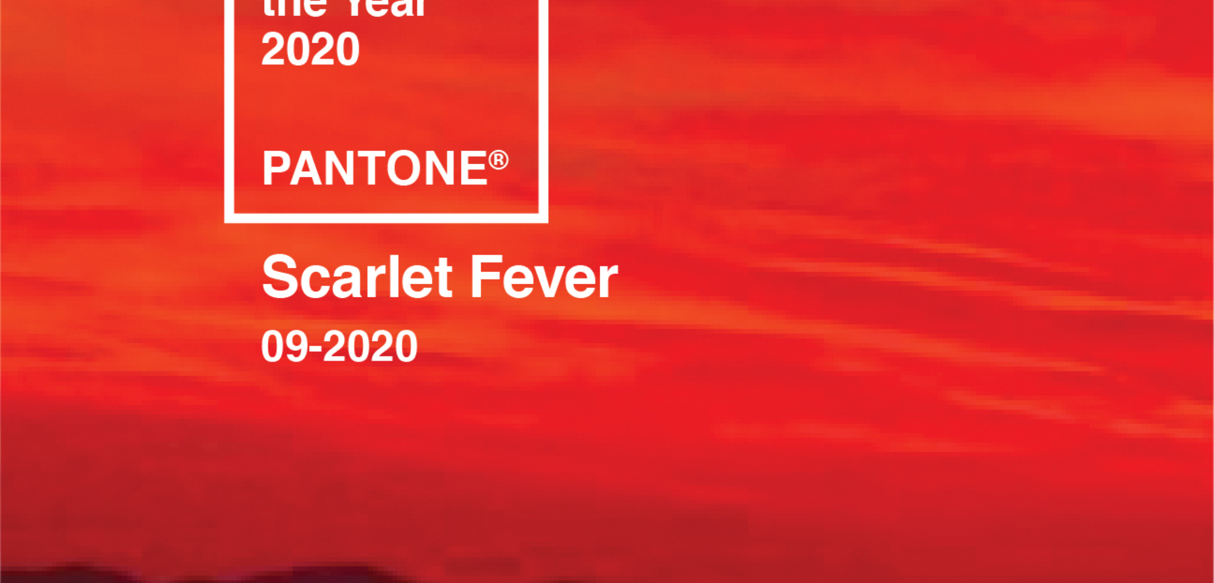
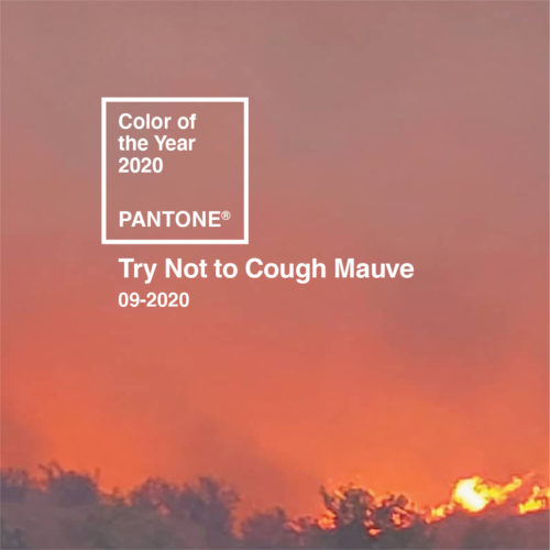
So, he envisioned creating Pantone-like swatches using images of the smoky skies. Soon dozens of his friends, colleagues, former students, and even strangers from all over the country began sharing their images of the skies they were experiencing.
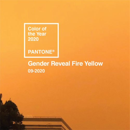
He transformed their images into faux-Pantone colors with clever or humorous names and posted on social media (like “Gender Reveal Fire Yellow” and “Gaze into the Fuchsia Abyss”).
“I had kept an example of Pantone’s Color of the Year in 2019 and had even used that blue on a few projects,” he said. “The idea of the ‘color of the year’ is what I came back to here.”
His social media postings caught the attention of American Prospect magazine’s creative director, who suggested publishing Bieloh’s colors of the inferno skies in its online news publication.
In a short article he contributed to American Prospect, which published the images in September, Bieloh said he was incorporating the colors of wildfire skies into Pantone-like images as a statement on climate change.
“As polarized as the nation is, we all share this common concern,” he wrote. “This series is a collaboration of images that have come to me from friends and colleagues and even strangers from across America—all of whom have been suffering from the effects of the smoke from wildfires.
“Bringing people together through this collaborative effort, and finding beauty and humor in the chaos, has been unifying for us all.”
Bieloh said from the beginning of his project, he planned to make a poster of the swatches with the idea of donating all the proceeds to the American Red Cross Society for those suffering from the western wildfires.
The result is a poster he titled, “United Colors of the Apocalypse/A Color Series for 2020,” which will be on sale soon. Check out his Instagram account for details.
To view all of Bieloh’s swatches:
instagram.com/davidbieloh/
prospect.org/culture/united-colors-of-the-apocalypse-pantone-2020/
comments powered by Disqus